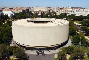
In mid 2017, Taro’s Origami was approached by the Smithsonian Museum in Washington D.C. about a project to re-create the famous Hirshhorn Museum building in paper. This is a great example of a collaborative project between Taro’s Origami Studio and a corporate client where the project went through many different iterations, to arrive at something better than when we began. To begin with- here is a photograph of the actual historic landmark on the mall in Washington D.C.
As you can see- the building itself offers some exciting and unique challenges for creating an origami version. To begin with, the building is round, which is always a bit of a challenge for origami design. Secondly, the building is lifted off the ground on a platform, so there is another layer of detail needed to create a good representation. The last and perhaps largest challenge for this project though, was the fact that the client wanted the model to be easy enough for people to fold on their own with only a little bit of instruction. What follows is a few of the stages that the Taro’s Origami team went through to work with the Smithsonian
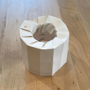
Prototype 1: This model was the initial steps taken just to decide on a generally feasible direction for the building. There are many different ways to approach cylinders in origami, but in order to make a model easy enough for others to successfully fold, The Taro’s Team focused on an external skin that could easily curl up from a flat piece of paper. The trade-off however is that the model looks more rounded the more folds that you add, but the more folds there are the harder it is to create. This lead the team to create other prototypes with less sides and an easier construction.
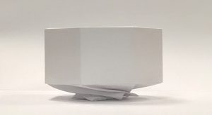
Prototype 2: The next model that was developed included a twisted base for the model to rest on, so that it has the same floating quality that the building does in how it feels elevated from the ground. The way this model was developed meant that there would also be both a top and bottom piece so that the model remained easy to fold. It also allows the model’s top section to incorporate color in the next iterations.
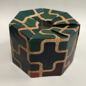
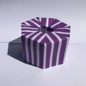
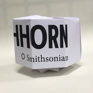
Prototype 3: The next versions of the model were at the request of the client to skin some fun and colorful designs onto the top part. These also show off the more polished open top part of the model to resemble the building. Taro’s Origami Studio was able to mock up several different versions of the model with different patterns and shaped on them. In the last picture you can see the final version of the prototyped model, with both the lifted-up pedestal and also the Smithsonian and Hirshhorn graphics added to the side of the model.
