Origami is a unique artform because of the wide variety of ways it can be created and used. Origami can be made by hand, pre-creased by machine, or even laser-cut. Throughout the years Taro’s Origami Studio has helped develop origami folding in these new ways, and we have always been up to a new challenge. So when Taro’s was approached in early 2019 with a unique request, we jumped at the chance.
The opportunity revolved around a new lobby for a space in the heart of downtown Oakland, where one of the Taro’s branches resides. They were looking for a unique art display form the community to fill the space, and it drew on all of the different ways to present origami that Taro’s has ever used. Here is a quick look at some of the inspiration for the project and how things turned out.
Inspiration:
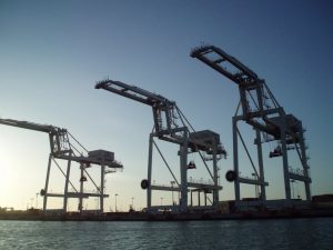
Oakland is a unique place. Even though it is often lumped into the “Bay Area” in the same way Brooklyn is often lumped into “New York City” it provides a lot of value on its own. Indeed, Oakland has consistently ranked as one of the most ethnically diverse major cities in the country and the Port of Oakland handles 99% of all containerized goods moving through Northern California, so it is a place all its own. To reflect this, the client talked with Taro’s Origami extensively about how to connect Oakland and the artwork.
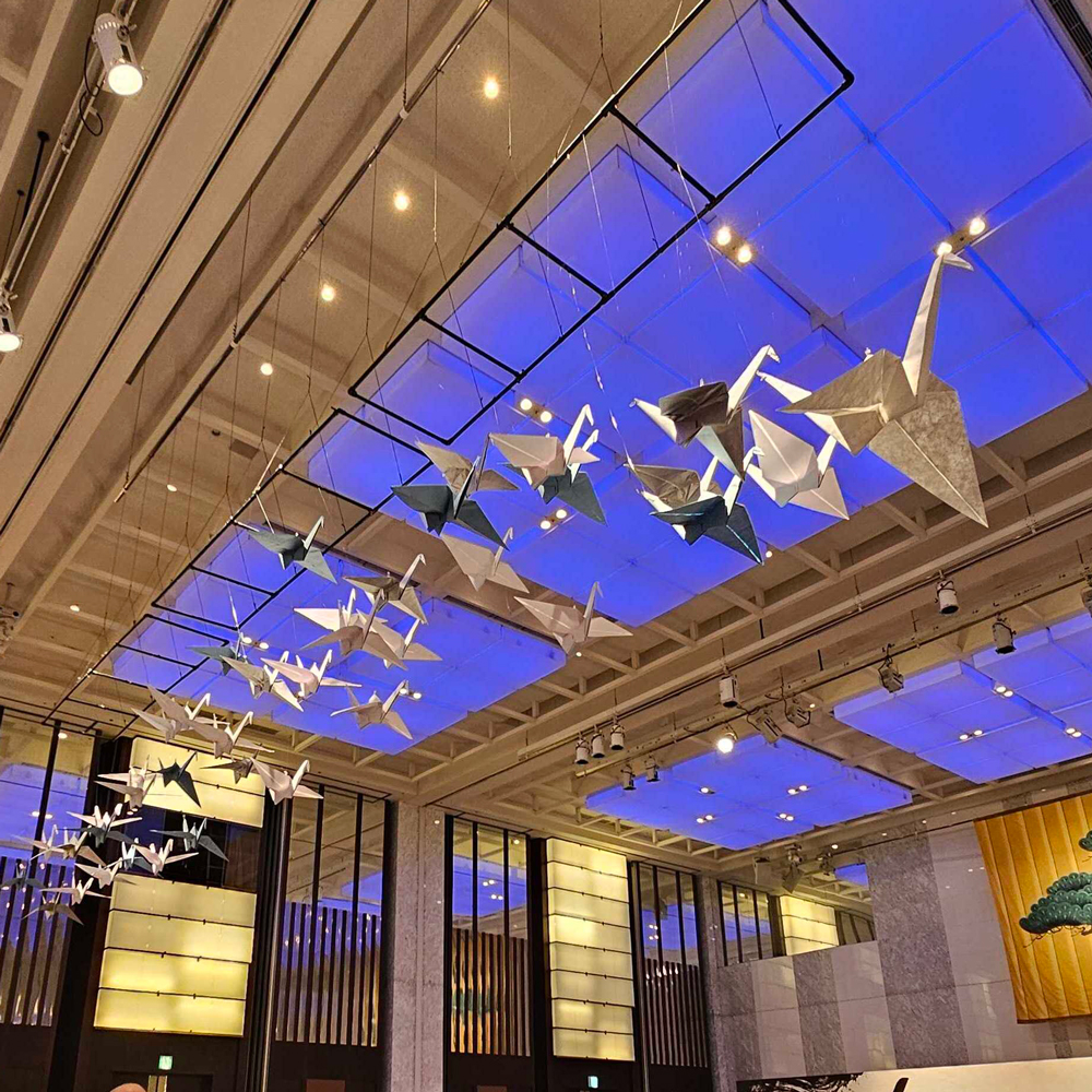
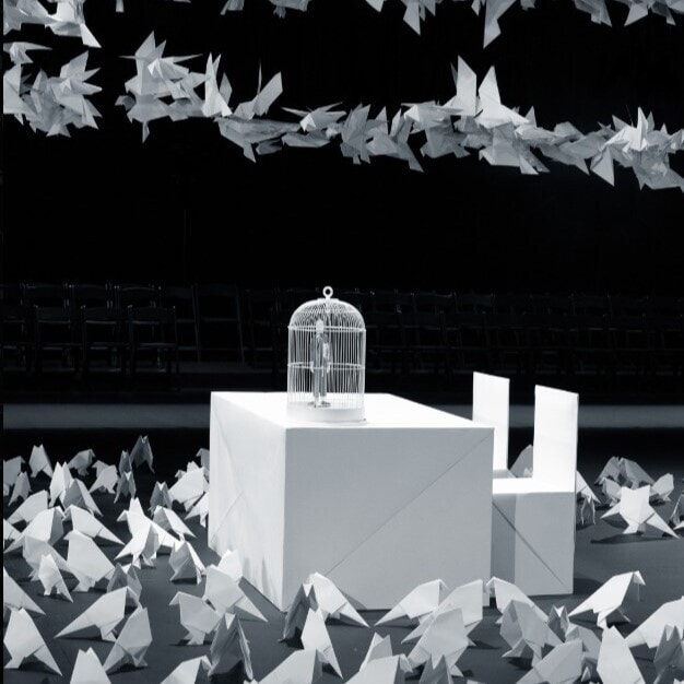
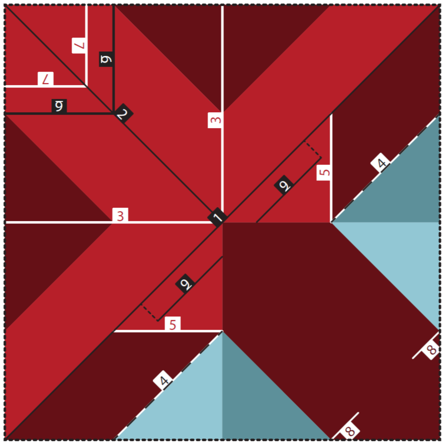
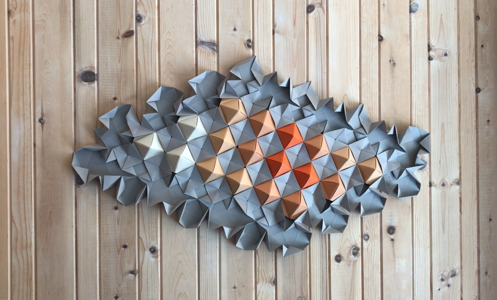
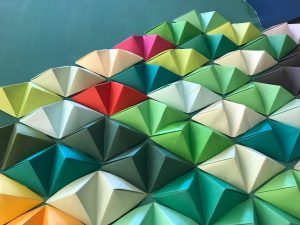
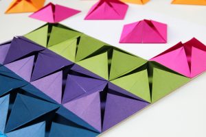
And here are some of the prior projects and installations (including one at our Oakland studio on our wall) that the clients were interesting in exploring.
Round 1:
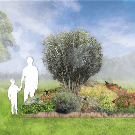
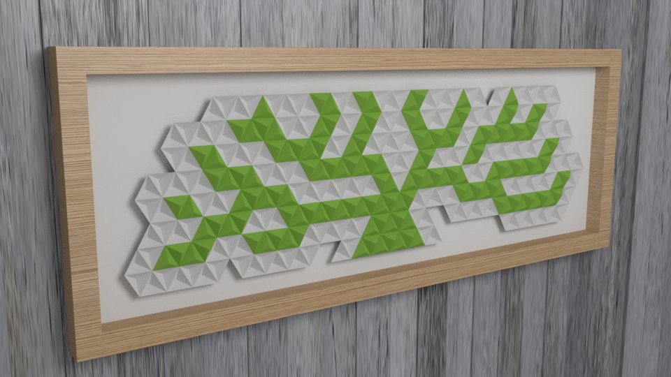
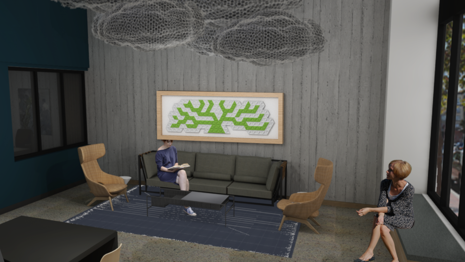
For the first round of options, the Taro’s team took the Oakland city logo and ran with it for a while. Using some simple origami modular units, the team found a way to basically sculpt a tree in a fun 2.5 dimensional way. If you look closely you can also see who the green and whites of the model alternate between concave shapes and convex shapes. Taro’s was also able to use the renders provided of the space and show how the final installation would look in the space.
Round 2:
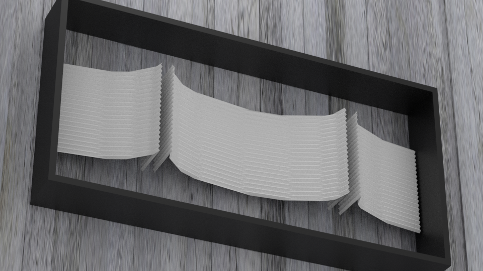
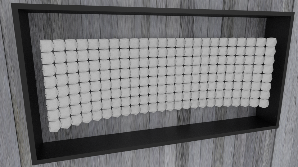
While the client liked the basic ideas of the first version, they were also interested in finding options that were a little more abstract. So Frank Ling the head graphic designer for Taro’s showed off his skills with 2 new versions. These shapes would use a corrugation technique of folding, which using a series of mountain and valley folds is able to create more dimensionality in origami. The first version was an early take on evoking the famous Bay Area bridges, and the second was a more abstract version.
Round 3:
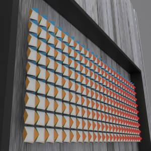
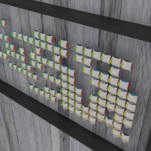
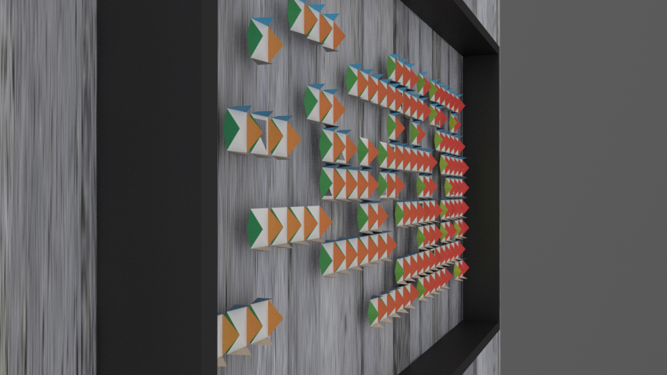
Having really responded to the second version of the previous models, the Taro’s team fully expanded the abstract version fir the next round of revisions. Using an interconnected network of shapes and panels, Frank was able to create what kinda resembled a hologram that would show certain colors only when seen from certain angles. This meant that if you looked closely, every viewing angle of the work could be unique, and if desired you could even create images that would show up are only certain alignments. There were also versions played a lot more with the removal of strategic segments as well.
Final Model:
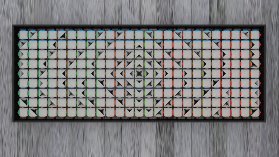
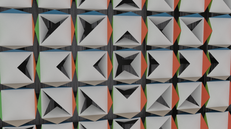
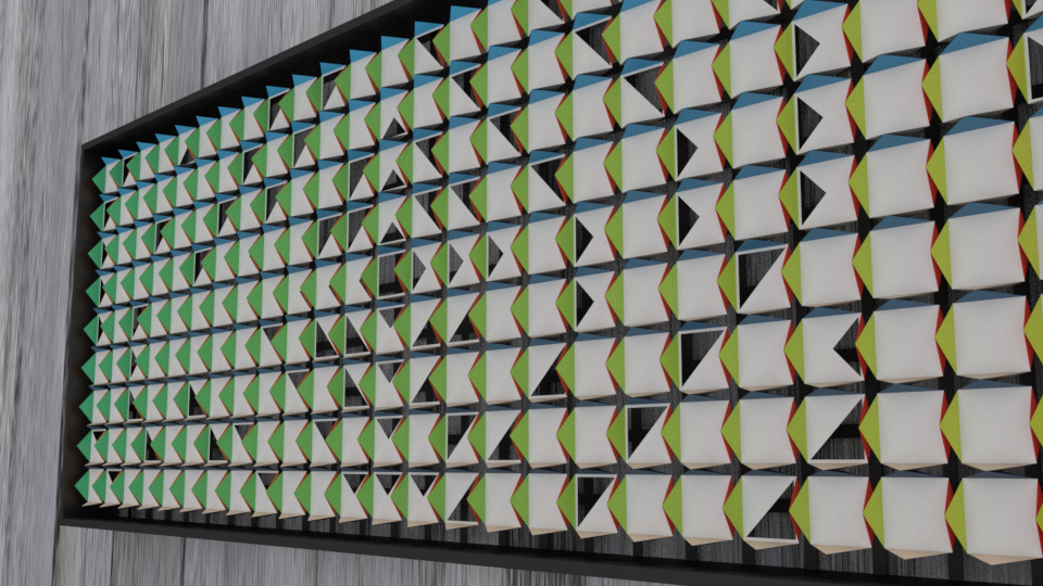
Having liked the previous version, a final rendering was created. Instead of removing segments, there would now be more interplay with certain segment having the ability to open and expose the wall behind them, grounding the work in the space more. The idea was also to show a work that implied the importance of water to the region and resembled a rippling of a drop in a the bay. Take a look up close at the final renders to see how it all came together. Each one of the units needed to be machine cut to exact specification to make sure the entire model fit together. In the end this project drew from a lot of the different things Taro’s has done in the past, but everything came together to really create something one-of-a-kind.
